
How to make your web content look stunning on the iPhone 4's new Retina display
The moment you first lay eyes on the iPhone 4's new Retina display, you are ruined. No other display will ever make you happy. Not unless it, too, is a Retina display. You start seeing pixels everywhere. My beloved MacBook Pro's screen? Pixels. The iPad I bought a few months ago and couldn't leave aside? Pixels.
Retina changes everything
The iPhone 4 really does change everything again and not just for phones. By introducing the Retina display, Apple has just changed the rules of the game. Make no mistake, this is as fundamental a shift as the move from black and white to color TV. I now want Retina displays on my next iPad and my next MacBook Pro (and will happily pay a premium for it). Whether or not Apple has the technology to meet the expectations it has now created with the Retina display on its other products is another issue (i.e., does the technology exist to manufacture a 326ppi 15" retina display for a MacBook Pro?)
With the introduction of the Retina display, Apple has guaranteed the following three things:
- Vectors will play a central role in any graphic production pipeline.
- You basically have to design liquid interfaces (and interface elements) for your apps.
- You won't be able to get away with the levels of image compression you've been using so far.
Basically, if you want your applications and web sites to look beautiful on the iPhone 4's new retina screen, you're going to have to create high-resolution versions of your bitmaps and/or use vectors. Resolution independence is here today and it is here to stay.
What about images in web pages?
While version 4 of the iPhone SDK handles much of the hassle of working with two versions of every bitmap for you by automatically loading the right image if you adhere to the simple naming convention of adding @2x to the ends of your image names, no such automagic handling of images exists for images in web pages. I'd been meaning to look into this since I got my iPhone 4 last week and was happy to see that Walt Dickinson beat me to it with his article on Targeting the iPhone 4 Retina Display with CSS3 Media Queries in which he draws on Dave Hyatt's post on high DPI web sites, John Gruber's Why 960x640 post, and the Safari Web Content Guide to suggest the use of device-pixel-ratio CSS3 media query to serve high-resolution images to devices with high-DPI screens:
Then, in the Retina-specific CSS, he loads in 32x32 icons as background images and specifies their dimensions in CSS pixels as 16x16 using the background-size CSS property.
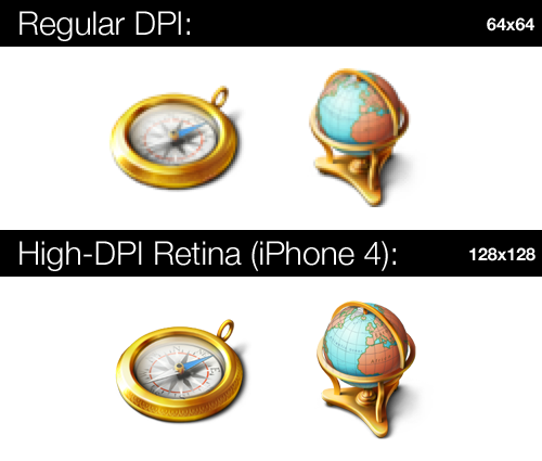
Demo
I put together a quick demo using the same technique that you can test out. It uses the lovely Smashing Royal Icon Set by Artua.com to embed 64x64 and 128x128 actual pixel size icons for display at 64x64 CSS pixel size.
Download the source (.zip; 74KB).
CSS media queries and background images are all well and good, but what about other visual assets such as images embedded on a web site via the img tag? Or videos?
A call for native browser support for high-DPI image and video substitution
I'd like to suggest that browsers adopt the same naming convention that Cocoa Touch uses to find and load high-DPI versions of image and video assets. That is, if I embed an image using the following code…

… it should load in flower.jpg when the device-pixel-ratio is 1 but it should attempt to find an image called flower@2x.jpg at the same relative path if device-pixel-ratio is 2 (and so on, for higher pixel-ratios), falling back to the original graphic if it can't find a high-resolution version.
(And the same convention could be used to load video assets.)
Update: Magne Andersson pointed out in the comments (and I agree) that sending two requests for every image asset would not be ideal. However, it would be easy to work around this by introducing a new HTML meta tag that tells the browser whether or not high-resolution images are available. The browser then only tries to load high-resolution images if the meta tag is present and if it detects that it is running on a high-DPI screen.
How to optimize for high-DPI screens today
Since browsers do not currently have this sort of automatic support for loading high-resolution versions of image and video assets, how can we detect that the site is being displayed on a high-DPI screen and load in high-resolution assets? The obvious way is to use a combination of CSS media queries and JavaScript:
- Use the
device-pixel-ratioCSS query to load in a high-DPI CSS file, - Set some CSS property to a unique value (to use as a flag),
- Check that value in JavaScript and substitute high-resolution image/video assets accordingly.
Don't forget about SVG
SVG has been the unloved step-child of the web ever since I can remember. However, it has really begun interest me now that we're moving to creating resolution-independent designs. (That's why I'm so happy that I have the chance to catch Doug Schepers's talk on SVG at tonight's SkillSwap after missing it during WebDirections @media.) If you, too, have been ignoring it, now might be a good time to take another look.
Why native iPhone app developers should care
Most native iPhone applications are – to some degree – hybrid apps and use the UIWebView WebKit control to embed HTML, CSS, and JavaScript content. Some native apps – such as those wrapped by PhoneGap, are almost entirely created with web technologies. Regardless of where on this spectrum your app falls, you will probably find yourself having to support high-DPI images in web content. Not only that, but UIWebView renders SVG so you could consider using it to keep parts of your interface as vectors without having to write custom drawing code.
The iPhone 4's Retina display really does change everything. The sooner you start thinking about (and practicing) resolution-independent design, the sooner you can start to take advantage of this beautiful new screen and the other high-DPI screens that will, no doubt, be following its lead.
Comments
by Robin Parduez on 2010-06-30 16:22:31
by Janos P Toth on 2010-06-30 13:34:18
by Aral Balkan · How to make your web content look stunning on the iPhone 4’s new Retina display « Blog Weblog on 2010-06-30 16:30:19
by Paul Rogers on 2010-06-30 16:35:16
by Jon on 2010-06-30 15:07:07
by Andrew Pryde on 2010-06-30 14:36:56
by Chris on 2010-07-01 13:36:30
by How To Use CSS3 Media Queries To Create a Mobile Version of Your Website « Talel Dridi on 2010-07-20 17:01:22
by Jeff Johnson on 2010-08-07 14:29:34
by Mike Weiss on 2010-06-30 18:46:52
by TC on 2010-06-30 15:49:09
by Ray Wenderlich on 2010-06-30 15:46:26
by Magne Andersson on 2010-06-30 14:46:18
by Aral on 2010-06-30 13:47:47
by Magne Andersson on 2010-06-30 12:10:17
by dirk on 2010-06-30 13:01:10
by SP on 2010-07-01 09:35:37
by Florent V. on 2010-07-01 11:41:40
by Gareth Adams on 2010-07-02 09:48:24
by James on 2010-07-02 11:18:25
by Benjamin Koh on 2010-06-30 15:33:07
by B on 2010-07-02 20:27:31
by Carlos on 2010-07-02 22:58:44
by Johnny on 2010-07-02 23:37:12
by Terretta on 2010-07-03 01:27:32
by dave on 2010-07-04 12:11:23
by Jason on 2010-07-10 03:05:19
by Gregory on 2010-06-30 21:55:24
by Auré on 2010-07-01 12:04:52
by Martin on 2010-07-02 01:00:09
by Ryan Bollenbach on 2010-07-02 14:18:13
by Alex Newman on 2010-07-02 14:24:31
by Dennis Phang on 2010-07-02 15:48:53
by Design notebook #44 – Superyacht, Minihome, Times Square Makeover, Space Suit Designs, Submarines that fly and much more… – The Blogs at HowStuffWorks on 2010-07-03 04:02:13
by Rob on 2010-07-03 16:56:43
by Tuomas Artman on 2010-07-07 16:28:13
by Jeffrey Bennett on 2010-08-31 07:27:08
by Troy Mcilvena on 2010-10-25 21:57:20
by vinpark on 2010-09-08 16:49:38
by Chris on 2010-10-12 10:15:58
by Anthony Alexander on 2010-10-22 06:09:03
by Chris on 2010-10-18 10:01:38
by Max C on 2010-11-29 12:41:44
by andy matthews on 2011-01-11 20:42:23
by datenkind on 2011-07-14 14:01:40
by Designing for the Retina Display (326ppi) « bento blogging on 2011-05-27 02:33:23
by Lee Probert on 2011-08-25 14:16:05
by Patrick H. Lauke on 2011-12-18 13:35:33
by matt on 2011-12-09 19:08:02
by Michael Robinson on 2012-03-10 15:52:40
by Steven West on 2012-02-24 18:23:24
by My most immense WORKFLOW icon Internetsite on 2012-05-12 02:49:25
by Bill on 2012-03-31 14:25:05
by Bardo Nelgen on 2012-07-10 10:32:16
by Phillip on 2012-09-24 23:06:19
by venetian plaster on 2012-08-26 20:44:51
by Instant Social Presence Review on 2012-11-03 19:06:47
by Suyog on 2012-10-08 13:11:34
by Phillip on 2012-11-04 17:15:27