
Better form validation in Flex
Flex comes with a built-in form validation system that unfortunately uses mystery meat tooltips to display component validation errors.
To see what I mean, take a look at the example I wrote a while back in the Validating Data Quick Start.
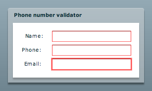
If you tab around that example, you may notice that you are probably doing something wrong (as indicated by the red borders around the form items that begin to appear) but you have no idea what you're doing wrong. In order to find out, you have to mouse over the form field. Only then does a tooltip appear to tell you what the problem is.
Needless to say, having the user switch input devices and exert additional effort in order to see a form validation error does not make for good ergonomics or usability.
A better alternative is to actually display the error message beside the control.
You can, of course, do this simply by having the error message in a label.
For example:
<mx:FormItem label="Your name">
    <mx:HBox>
        <mx:TextInput id="yourName" change="validateNotEmptyTextInput(yourName);" focusOut="validateNotEmptyTextInput(yourName);"/>
        <mx:Label id="yourNameError" visible="false" text="Your name cannot be empty."/>
    </mx:HBox>
</mx:FormItem>
The validateNotEmptyTextInput() method, in this example, is not a Flex Validator (as used in my Validation Quick Start), but a simple method.
For example:
private function validateNotEmptyTextInput(target:TextInput):void
{
    (this[target.name+"Error"] as Label).visible = (target.text == "");
}
In the above example, I'm using a pragmatic naming convention to create a generic validation method that works with TextInput components. Nothing too spectacular visually, but usability-wise already better than the default Flex behavior.
Creating an error Label for each component, though, is not very practical. We can overcome this limitation and add a little visual flare by using the Flex error tooltip instead of a label.
Kyle Quevillon has a post in which he details how to use the Flex Tooltip Manager to create Error Tooltips. Referring to Kyle's post, we can alter the validateNotEmptyTextInput() method as follows:
// If the TextInput is empty, display an error message.
if (target.text == "")
{
    // Has the error message ToolTip already been created?
    // (A reference to created ToolTip instances is saved in a hash called errorMessageToolTips.)
    var toolTipExists:Boolean = errorMessageToolTips.hasOwnProperty(target.name);

    if (toolTipExists)
    {
        // Error message ToolTip has already been created, just show it.
        (errorMessages[target.name] as ToolTip).visible = true;
    }
    else
    {
        // Create the ToolTip instance.
        var pt:Point = new Point(target.x, target.y);
        pt = target.contentToGlobal(pt);
        var errorTip:ToolTip = ToolTipManager.createToolTip(errorMessages[target.name] + " cannot be empty", pt.x + target.width + 5, pt.y) as ToolTip;
        errorTip.setStyle("styleName", "errorTip");

        // Save a reference to the error message ToolTip in a hash for later use.
        errorMessages[target.name] = errorTip;
    }
}
else
{
    // TextInput is valid. Hide the error message if one exists.
    if (toolTipExists)
    {
        (errorMessageToolTips[target.name] as ToolTip).visible = false;
    }
}
Where errorMessages is a hash of personalized messages:
errorMessages =
{
    yourName: "Your name",
    yourEmail: "Your email",
    phone: "The phone number"
}
Thus, we no longer need the Label component but there is a catch: we still need the HBox (or a container of some sort) if the TextInput is in a FormItem. Otherwise, contentToGlobal() returns an incorrect value when trying to position the error message.
So the new FormItem looks something like this:
<mx:FormItem label="Your name">
    <mx:HBox>
        <mx:TextInput id="yourName" change="validateNotEmptyTextInput(yourName);" focusOut="validateNotEmptyTextInput(yourName);"/>
    </mx:HBox>
</mx:FormItem>
And the resulting validation errors both look nice and are functional.
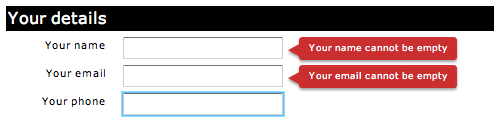
(In the above example, I modified the errorTip style to make the message boxes slightly shorter than usual by setting the paddingTop and paddingBottom properties to 2.)
To summarize, I'm not a big fan of the mystery meat validation error tooltips in Flex. Displaying validation errors on the form itself leads to better usability as users do not have to exert additional effort to find out what they did incorrectly.
Update: Someone has filed a bug about this very issue in the public Flex Bug and Issue Management System. I've left a comment on the bug and linked it to this post.
Comments
by aYo on 2008-01-10 12:25:06
by justin on 2008-03-26 19:57:08
by Ingo on 2009-01-12 15:54:18
by Hmm on 2008-03-21 21:37:07
by Ilan on 2008-01-22 12:42:41
by Sebastien on 2008-03-08 16:12:27
by Aral Ashole on 2009-03-19 20:19:40
by udayms on 2008-01-24 12:26:58
by udayms on 2008-01-24 12:25:47
by bjorn on 2008-01-10 09:29:43
by Gambit on 2008-02-25 23:01:53
by Gambit on 2008-02-25 21:47:30
by Gambit on 2008-02-25 23:03:03
by Leandro on 2008-03-28 16:55:14
by Quinton on 2008-04-16 23:58:24
by Dan W on 2008-01-18 13:23:24
by Hmm on 2008-06-09 18:57:43
by gembin on 2008-08-19 08:27:16
by Sebastien on 2008-03-08 16:10:57
by switcher on 2008-07-21 20:55:51
by Claudio Parnenzini on 2008-12-24 13:47:36
by Tami on 2008-06-15 05:07:13
by Hmm on 2008-09-29 16:48:36
by Hmm on 2008-09-29 16:45:04
by Todd Rothe on 2009-01-06 01:12:03
by Verbeterde validatie in Flex « Document & Messaging Integration on 2009-05-12 12:01:03
by Todd Rothe on 2009-04-20 17:39:54
by Enhance the default Flex form validation — Fine Tooth Floam on 2009-03-11 21:56:16
by tony on 2009-03-13 00:33:33
by tony on 2009-03-13 00:42:32
by Aral on 2009-03-20 16:53:14
by Todd Rothe on 2009-04-21 02:21:30
by Tony on 2009-05-06 05:26:04
by Babu Nazeer on 2009-03-11 16:43:26
by Marc de Kwant on 2009-12-01 17:18:19
by Adobe on 2009-12-31 13:11:58
by Ayub on 2010-02-01 07:31:02
by S3 on 2010-03-24 15:50:59
by Marc de kwant on 2010-01-30 09:17:36
by Nathan on 2010-05-07 13:39:48
by Marc de kwant on 2010-01-30 09:18:59
by S3 on 2010-03-24 15:59:01
by S3 on 2010-03-24 14:29:26
by maaz on 2010-03-30 04:28:46
by Prateek on 2010-04-29 05:07:24
by gsreddy6006 on 2010-04-06 07:26:11
by Rakesh Sivan on 2010-08-04 04:06:00
by Mark Foster on 2010-09-22 22:59:21
by shif on 2010-12-08 16:09:32
by experienced programmer on 2011-02-15 20:48:26
by Aral Balkan · Better form validation in Flex « Silversilkroad on 2011-05-31 07:42:20
by Sujeeth K. Pakala on 2011-07-22 06:13:47
by Sujeeth K. Pakala on 2011-07-22 06:15:37
by Atanu Bandyopadhyay on 2011-09-20 11:14:27