In the past few months I've been working to create a virtual tour of 10 Downing Street — the home of the British Prime Minister — for the Prime Minister's office in the UK. I'm happy to report that the tour, which I developed in Flash 8, is now in public beta on the 10 Downing Street web site.
As some of you know, I stopped doing hands-on development and programming for clients at the end of last year to concentrate on my my community projects as well as my consulting and training work. However, when my good friend Andy Budd mentioned that the Prime Minister's office was looking to update their Quicktime VR-based virtual tour to something much more engaging and interactive using Flash, I thought it was too interesting a project to pass up. So I literally rolled up my sleeves and decided to take it on.
By all means, it has been an interesting project and looks like it will continue to be as we evolve it in some exciting ways in the coming days and months.
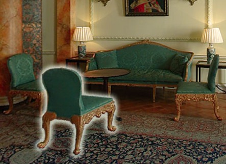
One of the unique aspects of the project was that it was actually built on a shoe-string budget (under £10K). This necessitated some creative thinking. The tour contains eight rooms and each room has several interest items (hot spots) that you can click on to get more information. I knew that the budget would not permit for a lengthy photo shoot so I had to fit it into a single day and mostly use available light. I hired photographer Caroline Malloy and panoramic photographer Rohan Perera — both of whom did a stellar job, working tirelessly and passionately under our pressing deadline. I ended up directing the eight-hour shoot in which we took a total of 1,259 photographs. They include 53 panoramic images, each of which is made up of 14 separate photographs. We used available light for the panoramas as lighting for each of the separate images would have easily taken up a week of production time and eaten up all of the available budget. This did mean, however, that I had considerable post-processing work to perform in Photoshop. (But, hey, any excuse to spend time in Photoshop, right?) We did do minimal lighting on some of the trickier detail shots (of which there were 742 shots taken on the day) but everything was done in strict triage. Once the initial post-processing of the images was complete, I went in a second time to visually color match the images with the actual rooms to make sure that they are as true-to-form as possible.
This project marks the first time that Flash is being used on the Prime Minister's web site and that, in itself, is quite exciting.
I decided to use Flash 8 for this project several reasons. The project brief called for an interactive experience and I wanted to push the boundaries a little on the virtual tours I had seen on the web during my research. Also, the bitmap features in Flash 8 made it possible for me to overcome a critical performance issue.
First off, I wanted the interest items to have soft glows around them. This proved to be harder than I first imagined due to performance reasons. The panorama component in the project handles real-time perspective correction on the images so you do not get fish-eye distortions. To do this, however, it slices the image up into about a hundred pieces and, in real-time, positions those images. (Actually, it makes about a hundred copies of the panoramic image and uses masking to display a little strip of each.) As you can imagine, this is terribly taxing for the CPU. When I added soft glows using the Glow filter in Flash 8, I found that the movie ground to a halt. (The glow itself was duplicated a hundred times in order to fit the perspective correction.) Instead, I was forced to render the glows as bitmaps in Photoshop and bring them in that way.
Also, I wanted to have the user interface be as invisible as possible so that users could explore the residence without the interface getting in the way. I decided to use a sliding panel to contain the room description, interest item details, and navigation neatly out of the way until needed. I didn't want even the tiny amount of real-estate that the panel took up when closed to block the panorama completely so I made the background of the panel slightly semi-transparent. When open, however, I didn't want the user to be distracted by the panorama in the background and I wanted to visually present to the user that the panel is modal. To kill two birds with one stone, I implemented a rack focus effect using the Flash 8 Blur filter. Again, however, I ran up against the performance issue due to CPU-intensive panorama component. (It is normal to grind the Flash player to a halt if you ask it to blur out a hundred 4,000 pixel-wide images, each with mouse event handlers active on them.) This led to me come up with an optimization. Basically, I decided to write a class using the Flash 8 bitmap features to take a snapshot of only the visible portion of the panorama, remove the panorama from the Stage and blur out this snapshot instead. With the panorama not taking up any CPU, I was able to animate the panel so that it bounces open smoothly.
As I mentioned earlier, this is the first time that Flash is being used on the Number 10 web site and, from what I've been hearing, they're very happy with the results.
The tour is scheduled to come out of beta sometime in early September and if you do notice any quirks, please feel free to email me or to leave a comment here.
There are plans to continue improving the tour and I would personally love to see accessible versions developed that make use of the multimedia capabilities of the Flash Player (the current version has an alternative HTML version for users with accessibility requirements -- this is, unfortunately, all that the budget for the first release allowed for.) Plans include the use of voiceovers and narration as well as alpha channel video in future updates.
Check it out here: 10 Downing Street Virtual Tour.
The Peek inside the home of the British Prime Minister article by Aral Balkan, unless otherwise expressly stated, is licensed under a Creative Commons Attribution-Noncommercial 2.0 UK: England License.


Wicked stuff Aral :) Nice to see you have been mingling with the main man.
BTW, id lose the bounce on the panel, it opens/closes too slow and the bounce doesnt fit.
I agree with Guy about the bounce. Make the animation a little quicker and use a smoother ease. Personally, I think the tabs on the panel are just a little too large, but I’m glad that they’re semi-transparent.
Overall, it looks great, though. Great job on avoiding the fish-eye.
Hey guys, thanks!
Guy, Josh, which systems did you try it out on? (Specs, player version, etc.)
Firefox 2 Beta 1 on Windows XP. Flash Player 9.0.16. 3GHz Pentium 4 with 1GB of RAM. I’ll take a look at it on my PC at home too. It’s a few years old, so it’ll be closer to what an average visitor would have.
Great work Aral, i know by experience that this kind of projects is always hard and it looks really great.
For me the speed of the bounce is good.
Thanks, Gilles — you’re very kind and I really appreciate the feedback :)
slooooooooooow…
Pentium 4 1.5 , 512 mb
Hi Miguel, which FP version are you using? Thanks!
Hey Aral,
its very slow on my glorious Dell inspiron 2.4 celeron 256mb in IE beta and flash player 8.0.24 (I know you would only dream of using such a combination!). Will get the guys to check it out on some other setups tomorrow for ya.
Dan
Looks good. Just a few things. Major jaggies/artifacting on motion. Are these lo-res while panning? Can you not convert to bitmapdata and apply smoothing? Some of the furniture hotspots seem out of proportion and dont look well placed. And defo lose the bounce on the nav. Also maybe you want to do a timer on your onRelease, that way you can check whether visitors are actually clicking on hotspots to get info or just trying to navigate as real estate is so tight. On the whole its a neat project – well done!
MaTT
Hi Matt,
It does go into lo-res while panning. Again, a performance issue with the real-time perspective correction. In hindsight it would have been better to perspective correct the panorama at development and simply pan it. Definitely something to consider for the next iteration.
Can you tell me which hotspots look out of proportion to you. I’ll give them a look.
Thanks again for your comments.
Hey Dan,
Thanks, man. Much appreciated :)
Hey Aral,
Wow, Great job!
I think it might need maybe 20-30 more slices towards the middle areas where the slices get thicker because they’re a bit too noticable in diagonals like where the walls and ceiling meet or if a maginfying glass lands on the split.
However, It runs silky smooth on my rig. I can pan as fast as I please with no stutter or compromise in quality. I’m using Flash Player 9, Firefox 1.5, Windows XP Pro x64, AMD64 FX-55, XFX GeForce 7800GT, 1Gig RAM. OK, not exactly a median system but your SWF looks freakin’ awesome none the less.
– JOR
hey a.
first of all: most importantly, great job, very smooth. secondly, when the nav’s down, tabbing goes rooms 1-3 then the exit button then rooms 4-8. ’seems a bit odd to jump to the exit button at that point.
r.
Hi Aral,
site looks great nice work!
I think the CPU issues will be mostly due to the use of masks in the panorama effect. I’ve built several similar effects using bitmap fills and matrices which massively outperforms the masking method. I’ll show you over coffee sometime… after all, we are neighbours!
:-)
Seb
Hey Aral great stuff! the panaromic view is cwweeet!! got few info though:
Couple of times when the rooms were initializing i got the Flash Player popup window saying the script is running too slow and i had to force abort the script.
Although the transaction is smooth for me, i’d too get rid of the bounce effect.
When i move around the room the whole image seems to be broken down into lines(result of using masks?). Though it doesnt degrade the experience, a smoother flow would be a jewel in the crown.
Couple of weeks back i was checkin out http://www.custommedia.co.nz/swfz/index.html and was wondering how nicely they have worked on the sky… but i dont know how relevent it would be to apply a similar technique to your project.
great stuff goin around… i’m sure the final version will be a bomb!
interesting, but you have to lose the bounce and make the drop down come down faster.
the magnifying glass icon gives the user the impression of a zoom effect kicking in. A letter ‘i’ for info icon would perhaps be better.
Cool! Aral. This is by far the best implementation of any panoramic images I’ve seen implemented Flash :D
I’m looking forward to the day when it’s possible to move beyond “simple” cylindrical panoramas and implement proper spherical/cubic panoramic images.
I’m not a big fan of the classic imperial style of the building, heraldics, typography etc. set in contrast to big and bold XP’esque icons… Perhaps it would be better to use some ui elements which are more graphical. Ditto what others have said about the info panel. I really like the way the panos blur when getting more info about some detail.
Performance wise, no problems here. I’m on a first generation G5 PowerMac with Safari and Flash Player 9.0.16.
/tinker
Hi Aral, some of the furniture looks out of place with the glow. You could either do some realistic shadows in PS and place them directly behind the items with a blendmode, maybe you have the glow toned down a bit and as you come towards it it gets a little stronger. I think people like to explore a bit, showing them everything as blantantly clickable, well I spose there’s a usability argument I wont get into based on your target audience I guess youre on the right track. Also, the images lack punch, they need a bit of a tone ramp, a simple s-curve, and drop the mids a touch. Are they loaded in dynamically, or easily replaceable through a lib update? Then it would be easy One piece that looks out of place is the big chair as you walk in, all these items would look better if you had a showdow png under.
cheers
MaTT
This looks really good. One other optimization trick–if you’re not already doing it–is to “prerender” all the steps of the blur filter. That is: click, render each step of the blur into a separate bmp into ram, then play the animation (each bmp in sequence). Compared to generating the bmps as the animation plays (that is: click, render one bmp, view it, render the next bmp, view it…etc.) is slower.
I vote against the bounce… seems gratuitious… doesn’t add anything and actually increases the delay before I can read the content. Having it move down is great because it informs us where the thing is coming from. Just no bounce needed.
Also, the initial instructions are only on during the pre-load. I can’t read that fast. Perhaps have a button appear “click to view the room now” with an option of “jump right into the room next time… don’t show again”
The rollover to make pieces glow is slightly delayed–probably not worth addressing.
Now.. here’s a huge one which is definitely questionalble: perhaps make the background move in the direction I’m dragging–not the opposite. Sort of like if you spacebar-drag Flash’s stage. Regardless I think it wouldn’t hurt to tweak the variables on the movement.
Kudos on the pano-slice. That sounds major. As an american, I’m not sure if the prime minister or queen or someone else lives there… who ever it is–did you get to say hi to them? Do you get to be knighted or anything cool like that? I’d be impressed!
hey aral,
here maybe still a bug
if you go into a room and click on an object, you get detailed information.
now, if you close the panel using the ‘X’, and then click on the ’searchloop’ (you know, that thingie sherlock holmes used (can’t find the word i’m looking for:)) there will be still a “return symbol” on the last clicked object
hope you understand what i mean!
Guys, thanks for the great feedback. Needless to say, these are being noted and I plan to act on them in future iterations.
Hi Aral!
I was really looking forward to see this project since you told me about it in Kortrijk.
From my point of view (infographic>informative) I would add a few concept things.
You need infographics advice!! guy :-)
Bye,
David
Hey David,
Definitely, man — let’s talk. I’d love to have your input! :)
[...] The reporter did mention that the press release issued by No.10 included a link to my blog but not my contact information so he had to Google me for my number (yep, guilty as charged, I never have gotten round to putting my contact information on my blog) so here goes: If you’re trying to reach me regarding the No.10 story, you can call me on +44 779 555 1278. You can also find details on the No.10 project on this blog post that I wrote earlier. [...]
Hi Aral – saw the press in today’s paper and as a head of design in london and someone generally interested in all things design/flash/interactive, I thought i’d have a look, especially since they deemed you a “web guru”.
Aside from the comments of it being slow, etc. and the fact there was a small budget (which i appreciate), I’m surprised at how simple and “dated” the solution is. It is screaming for more user interaction, slicker interface, and more engaging/immersive experiences. You’ve basically taken panarama shots, taken them into photoshop, highlighted special items with a ghastly white glow and brought them into a flash panorama video. The dropdown menu with related info works, but it’s just kindof boring and simple…
I’m just a tad dissapointed with the whole thing. I think much better can be done, even for under £10k.
I think we, as designers and developers, need to push the limits and break the mold – and a high profile project like this is a perfect opportunity. What you have done will likely be successful due to the exposure and the novelty of it, but in terms of an elegant, slick, smooth, and progressive flash piece, it falls way short in my opinion.
Anyway, just my .02. If i was paying good money to hear you speak and review your work at events like Flash on the Beach, I would expect better.
all the best.
Hi Charles,
Thank-you for your feedback.
As I mentioned in my postmortem, the project was created on a shoestring budget and under a very tight schedule. Beyond that, however, on certain projects you do not always have the opportunity to implement every great idea you come up with. For example, I would have loved to have been able to allow the user to walk through the actual building but we were not allowed to show the relative locations of the rooms for security reasons. Similarly, I would have loved to have used alpha channel video and an audio voice-over but we could have easily spent the budget on the shoot/talent/etc. alone.
This project was primarily meant to be an upgrade on the existing QuickTime tour that opened in a pop-up window, was tiny (dimension-wise, not bandwidth-wise) and had no interactive features beyond the basic panorama functionality. Thus, our first priority was to update and modernize the tour, adding basic interactive features that were not possible in the QuickTime version. Of course, opinion by its very nature is subjective and although you may see the tour as “dated”, it actually was a leap into the future compared to the existing one.
You also have to take into consideration that his was a government project. The public sector is usually slower to embrace the latest and the cutting edge than private industry. Getting them to use Flash on this project in and of itself was a great first step and will hopefully constitute a precedent to make it easier for other Flash developers to develop applications and experiences in the public sector in the future. This is how I see this particular project: a first step. This is the first time Flash has been used on the Prime Minister’s web site and it was introduced as a technology that could help them incrementally update an existing feature (the QuickTime tour) while adding features that enhanced the experience.
Finally, you have to realize that we are constantly fighting certain prejudices against the use of Flash. One of these is that Flash sites are gimmicky pieces of eye candy without substance. So the decision to make the tour as highly functional as possible and to keep the user interface as clean and unobtrusive as possible was not a random one. In any development project, it is of primary importance to identify the key problems you want to solve for your audience with your application and then concentrate on implementing the solution in an iterative manner, starting with the most important user tasks and layering both the development process and user interface accordingly; all the while focusing on simplicity. Complexity happens; simplicity, you have to strive for.
Finally, regarding Flash on the Beach, you can read some reviews by attendees for first-hand feedback.
Aral, Great work looks prestige that you did the work for the main guy. But i supoose there were some things which can be corrected like maintaining the state of teh view details. And suppose if we click on the tab for the second time. It shows the reverse animation. Apart from that it looks cool man.